Overview
In this blueprint, you’ll learn how to create attention grabbing images for your ads in just a few minutes… even if you don’t have your own images or you don’t know how to use fancy software like photoshop.
While the principles and techniques can be applied to any kind of advertising, we’re going to focus on creating images specifically for Facebook Ads.
How You Can Use This:
- You can use the guidelines to pick the best images for your ad.
- You can use the blueprint to improve your existing Facebook ad images.
Tools And Resources
Creating attention grabbing images is challenging especially if you don’t have any photo editing skills like photoshop.
This is why we created this blueprint to help you get started on your journey.
As a guide, we included a PDF version of the blueprint.
You can download a PDF version of the blueprint here.
One of the main tools we’ll be covering is Canva, a free graphic-design platform you can use to create just about any kind of marketing material you image.
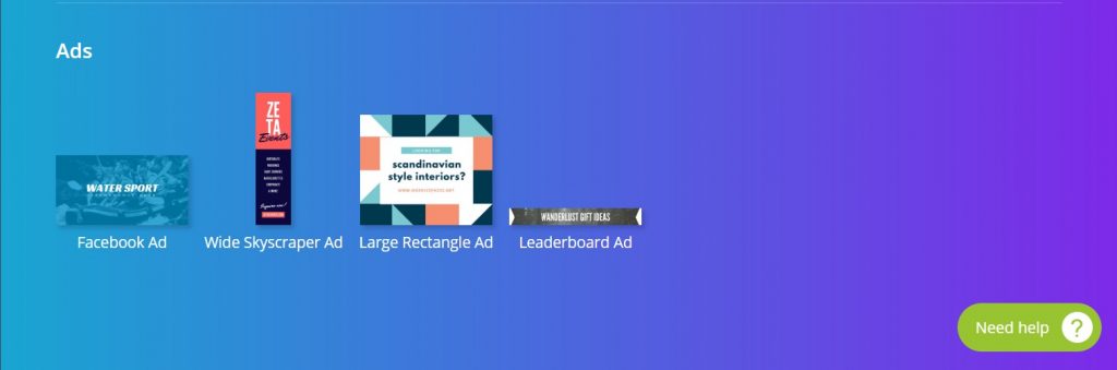
Image Requirements For Facebook
This is the most common and basic type of Facebook Ad. You’ll use this ad image size for almost all placements on Facebook.
The image specs for this type of ad are:
- 1,200 X 628 pixels for image size
- 1.91:1 for image ratio
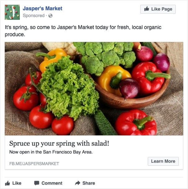
(Credit: Facebook)
A carousel ads allows you to display 2 or more images and/or videos, headlines and links or calls to action in a single ad.
Viewers of the ad can then scroll through the carousel by swiping left on mobile or clicking the arrows on desktop.
This ad format is especially useful for products based businesses as they can display multiple products in a single ad to promoting their brand.
The image specs for this type of ad are:
- 1,080 x 1,080 pixels for image size
- 1:1 (square) for image ratio
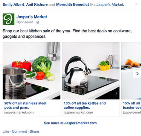
(Credit: Facebook)
This ad type is similar to the single image ad type.
The only difference is that you can use multiple images and create a slideshow within Facebook’s Ads Manager itself.
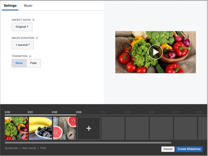
(Credit: Facebook)
Slideshow ads play automatically on Facebook, which helps catch the attention of your audience.
In addition, they are easy to make and edit, with low production cost as compared to video ads.There is even a free library of music you can use with your slideshows.
The image specs for this type of ad are:
- 1,280 x 720 pixels for image size
- 16:9, 1:1, or 2:3 for image ratio
We recommend that you use images that are all the same dimensions. Otherwise, your slideshow will be cropped to be square.
The challenge that advertisers are facing is that for ads that link viewers to their website, the load time is slow and may not be optimised for mobile. So this reduces the quality of the viewer’s experience.
Because of this, Facebook created Canvas ads to solve this problem.
A canvas ad is post-click, full-screen, immersive mobile ad experience on Facebook that loads nearly instantaneously.
For example, Coca Cola created a Canvas ad that reached nearly 16 million people and had an average view time of 18 seconds. The ad featured the newly launched special series of Aluminum Bottle.
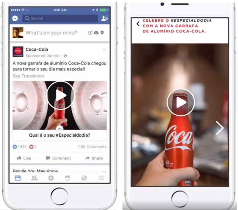
(Credit: Facebook)
However, creating Canvas ads is an elaborate process that involves time-consuming actions such as creating your own unique creatives and setting up your own landing page/website. We’ll cover Canvas ads in another blueprint in the near future.
Guidelines For Attention Grabbing Ad Images
In this section, I’ll share some of the guidelines you for creating ad images that works best for ads.
These guidelines will serve as best practices for yourself and your team to reference when you pick and create your ad images.
Here’s a quick overview of what we’ll be covering in this section:
- Human faces
- Emotional
- Use the right colours
- Stand out
- Uses attention cues
- Relevant to market and message
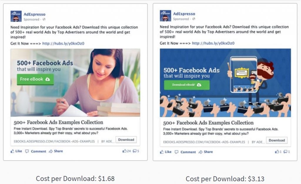
Using human images, especially of someone looking straight at you have been proven to convert.
Human images are one of the easiest ways to make a real, human connection with your audience.
Ads with such images have been proven to perform better than non-human ad images.
For example, when AdEspresso tested two different images for a lead magnet campaign, the cost per download for the ad with the human image ($1.68) costs half the cost then the other non-human ad ($3.13).
(Credit: AdEspresso)
People tend to resonate with images that make them feel some kind of emotion.
If they can relate to the emotion then it will be even better as this will instantly form a connection with them and get their attention.
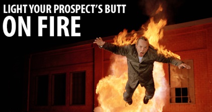
For example, we created this ad image to get sign ups for a real estate Facebook workshop.

The image shows a professional looking stressed while looking through documents that look like portfolios.
The black and white colour intensifies the person’s frustrated emotion.
On top of that, the words in red and caps further intensifies the feeling of frustration.
Many real estate agents who were facing a similar challenge could relate to the ad image which instantly led to a flow of qualified sign ups for our real estate Facebook workshop.
Psychological studies have also shown that people naturally associate specific colours with certain characteristics. Check out the infographic by ‘The Logo Company’.
(Credit: The Logo Company)
Colour psychology is a crucial aspect to consider when it comes to building your brand through your ads.
As a general guideline, you want to use your brand colours for your ads.
For example, we used blue in our logo and many of our ads because want to position GrowthTribe as a trustworthy and dependable resource.
![]()
Did you know that on average, 5,000 images are being shared every second across Facebook?
This makes it even more crucial that your image can stand out and be noticed by Facebook users who are just browsing on the platform.
You can help your image to stand out using the following ways:
Bright Attractive Images
Bright images give people a positive feeling and are proven to be more emotionally arousing.
See how brightness intensifies the person’s facial expression and makes it look like she’s ‘glowing’ with happiness. This makes the image more attractive and eye catching.

Borders For Your Images
Using borders can help your image stand out, especially if the default background for your image is white. Here’s an example:

Weird Images
Weird images not only grabs your viewers’ attention but they tend to be more memorable as well. Whenever possible try to use images that are out of the box but still relevant to your business.
Take for example the image below.
An attention cue is a visual cue that guides your viewers’ eyes to a certain direction like a text box or a Call-To-Action button.
It can be subtle or obvious.
In our example below, notice how the lady is subtly pointing to the green textbox. This guides the viewer’s’ eyes there so they will read the text.

It is crucial that your ad image is line with your target audience and your ad message.
If you’re selling to Asians, it’s best to use the images of Asians rather than Caucasians.
You’re more likely to get a response from the audience because they can relate to it.
Here’s an example of an ad that we ran for a natural health supplement for young children.
You’ll notice that we used an image of a young child running towards the audience with the key message of the product “100% Natural Supplement” included in the image.
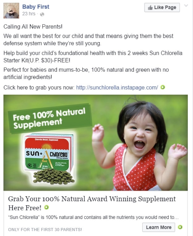
(Credit: Baby First)
Where To Find Images?
It’s not always easy to find images for your ads.
In fact, this is probably the most time-consuming part of putting your ads together.
And you don’t always find the perfect ad image that you want.
I usually start off with writing the ad copy first (e.g. post text, headline and description).
Note: If you like to find out more about writing high converting ad copies, you can check out our blueprint on it, How To Create Facebook Ads That Sell.
Once I’m done, I’ll write down a few ideas of ad images I would like to find.
Here are a few examples:
- Asian girl smiling
- Child crying and parent looking frustrated
- Cheering crowd
I’ll tend proceed to look for images using the sources below.
Whenever possible, try to use your own images.
We usually make it a practice to take as many pictures as possible about the product or service that we’re promoting.
If you have the budget, you can hire a professional photographer to help you out.
Our preference is to train our team members to use their smartphones to take great pictures and videos for our ads.
Here are a few guidelines we usually cover with the team when it comes to taking pictures:
- Natural – use natural sunlight or soft lighting if possible. Feature real people to capture the moment.
- Clear – Keep the subject line in clear focus. Avoid visual elements that distract the eye from the main subject.
- Simple – Less is more. Minimize the number of elements within the photo. Keep only the essentials.
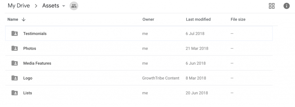
For each of the projects we’re working on, we’ll create a Google Drive folder to consolidate all the assets. You can see an example below.
Of course, in the case where you don’t have your own images and you want to get started, you can use the other sources below.
Google Images is a great source for images.
However, it’s important to take note of the licenses for the images to make sure you do not infringe any of the copyright.
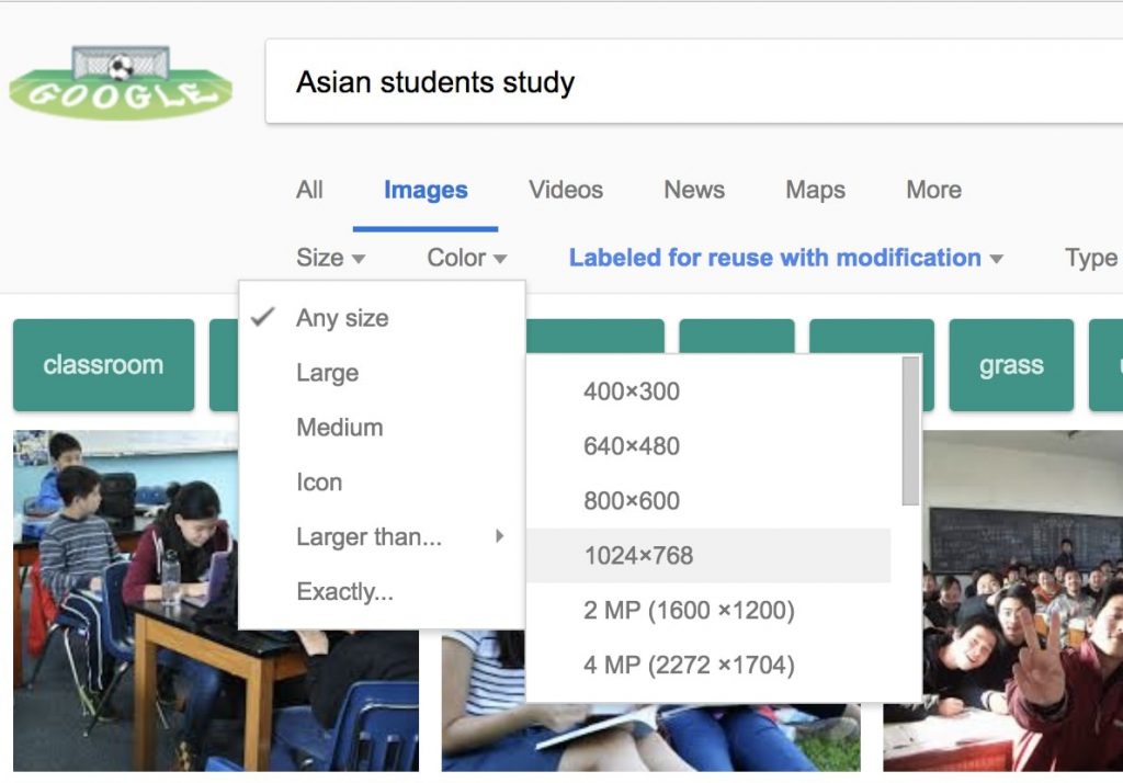
For this section, let’s assume that we are finding photos of Asian students for a tuition centre’s Facebook ad image.
Go to http://images.google.com
Search for the image you are looking for. In this case it is ‘Asian students study’.
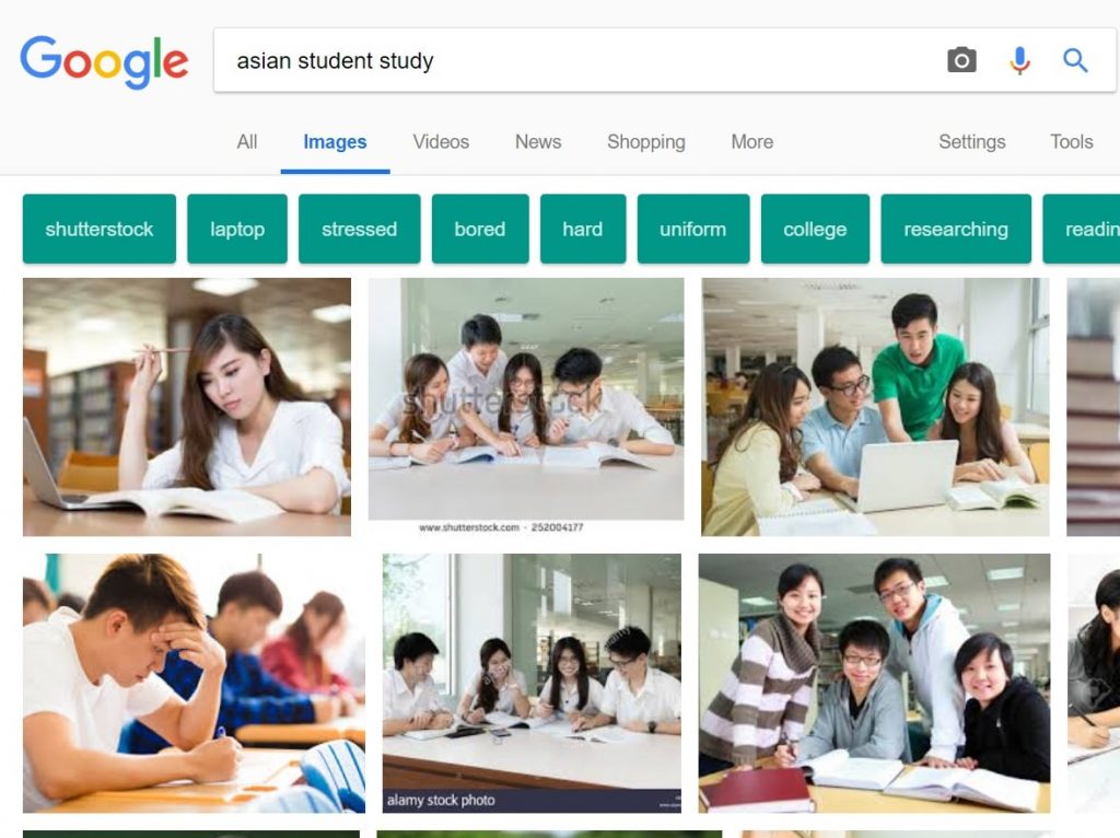
(Credit: Google)
Once the results are generated, click ‘Tools under the right side of the search engine bar then a bar will pop out.
Click on usage rights and select ‘Labeled for reuse with modification’.
The results will display images that are free to be downloaded and can be edited.
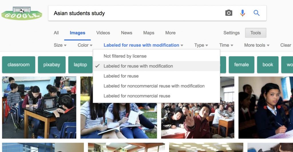
(Credit: Google)
Note: Sometimes the licenses of the images might not be updated on Google It’s important to go into the website or source of the image to read the licensing agreement.
You can click on “Visit Site” and see you can find out if the image is free for commercial use without attribution.
If attribution is needed, this means you’ll have to credit the source of the image with a link back to the original site where you found the image.
Here’s an example below:
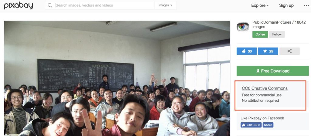
(Credit: Pixabay)
I like to choose images that are larger than ‘1024 x 768’ if possible. This will ensure that my images are sufficiently large for the Facebook Ads.
(Credit: Google)
Click on the image you want and right click to ‘Save Image As…’ to download the image. It should be stored in the Downloads folder in your computer.
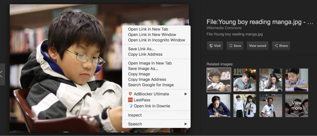
(Credit: Google)
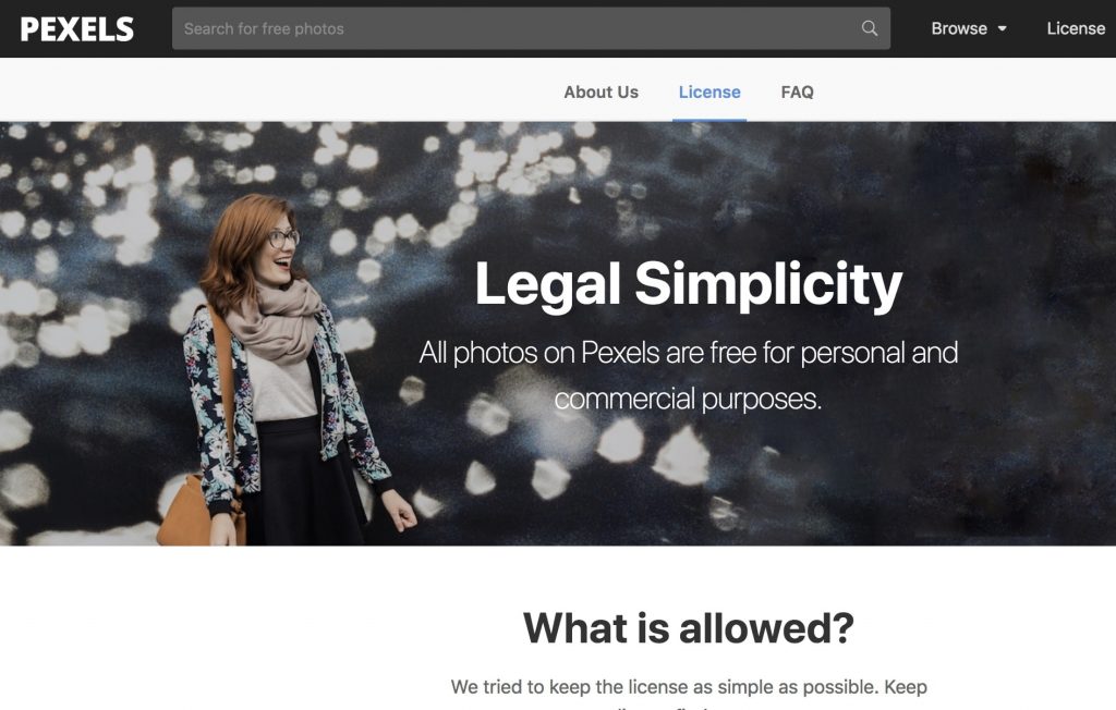
The good thing about Pexels is that they’ve kept the license agreement as simple as possible.
All photos on Pexels can be used for free for commercial and noncommercial use.
(Credit: Pexels)
Users are also not required to attribute or cite credits to the creator of the photo or the Pexels website.
Users are even allowed to modify the photos as they you like.
More information on the licensing policies here: https://www.pexels.com/photo-license/
For this section, let’s assume that we are finding photos of Asian students for a tuition centre’s Facebook ad image.
Go to www.pexels.com.
Search for your image you want.
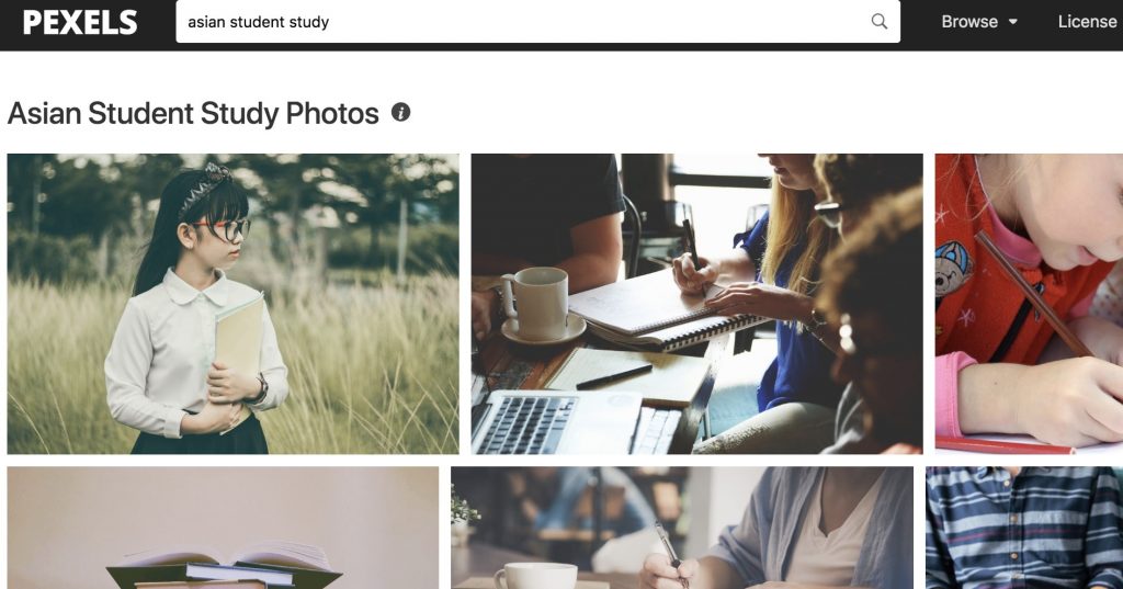
(Credit: Pexels)
Click on the image you want to use.
Select the size of the image you would like to download.
I don’t recommend downloading the largest size possible since it will take too long to download and upload for editing later. Instead go for ‘Medium’ or ‘1280 x 853’.
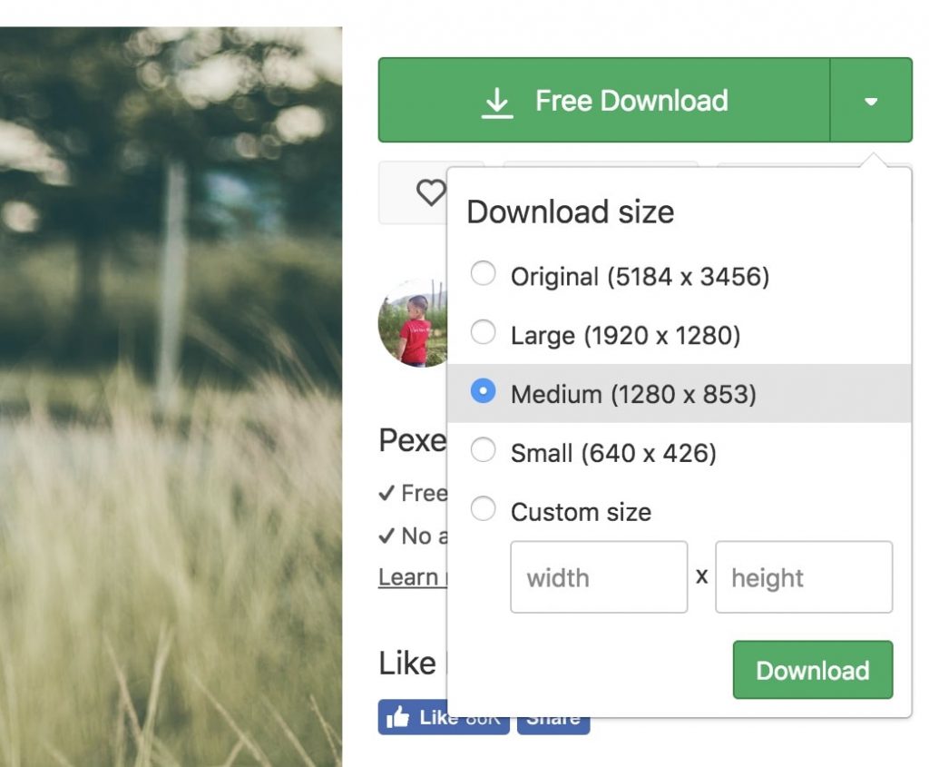
(Credit: Pexels)
Another good resource for stock images is found in the Facebook Ad Manager.
Facebook has collaborated with Shutterstock to provide an extensive library of stock images that advertisers can use for free.
Search for your desired image, select it then click confirm and it will be set as your ad image.
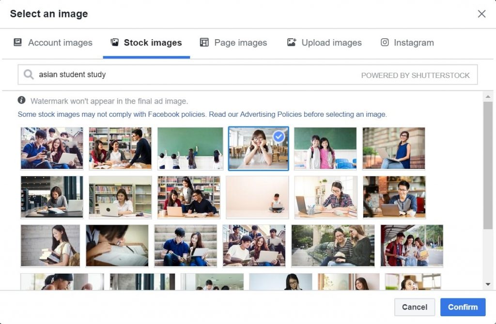
(Credit: Facebook)
However, the downside to this is that you cannot edit the image and add the persuasive elements that we shared with you previously.
However, they allow you to get started on your ads as quickly as possible.
Using Canva
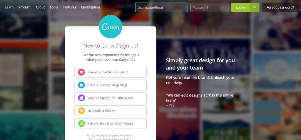
One of the easiest and effective methods to creating an ad image that we teach our clients and new hires is by using Canva.
Canva is a graphic-design tool website. It uses a drag-and-drop format and provides access to over a million photographs, graphics, and fonts.
The free version is good enough for you to use if you are just starting out to creating images for your Facebook ads.
Go to www.canva.com and sign up for an account. For this section, we selected the ‘Small Business (startup,blog)’ option when signing up.
(Credit: Canva)
After you create your account, you will be redirected to the home page.
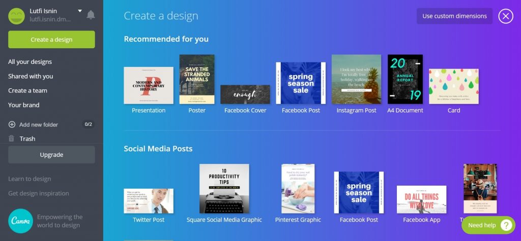
(Credit: Canva)
As you can see, Canva has an extensive range ad image templates for you to choose from.
Each ad template even has the correct size for each placement on different marketing platforms like Facebook and Instagram.
For this section, we’ll be sharing with you how you can create a high converting ad image for your Facebook ad.
Scroll down the page and select the Facebook Post Ad template.
(Credit: Canva)
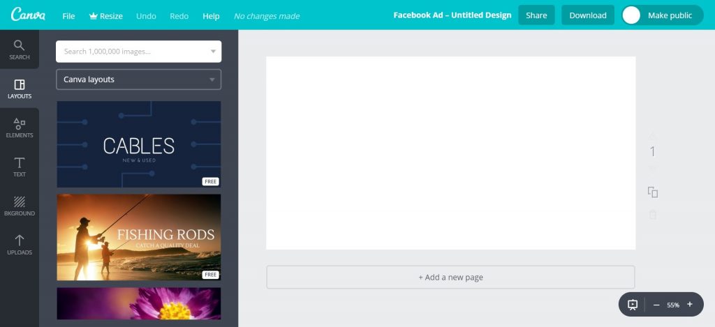
You will see the editor below. This is where you’ll do a bulk of your editing.
(Credit: Canva)
Click on the ‘Uploads’ icon on the left bar of the page.
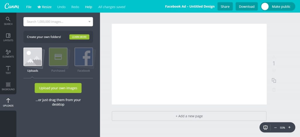
(Credit: Canva)
You can click the ‘Upload an image’ button to import your image.
Or you can drag the image you want to edit from the folder in your computer and drop it in the black space.
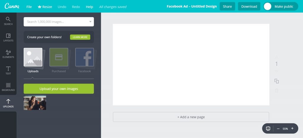
(Credit: Canva)
A grid is a template that you can use to create a collage or a wallpaper for your ad image.
Click the ‘Elements’ icon on the left bar then click the purple ‘Grids’ icon. You will see different types of grid formats.
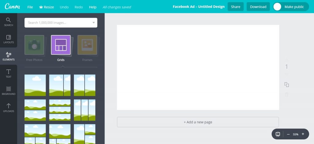
(Credit: Canva)
For example, if we selected the single grid, it will appear in the work page on the right.
Click the ‘Uploads’ icon on the left bar and drag an image over it. The image will automatically be resized to fill up the grid.
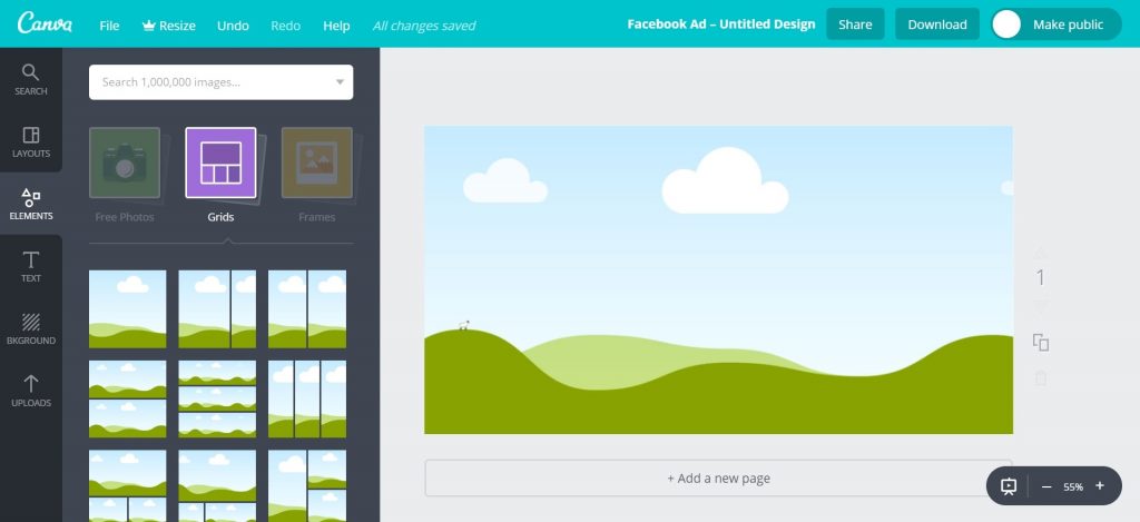
(Credit: Canva)
 (Credit: Canva)
This function saves you time so you don’t have to manually crop your image to fit into the Facebook ad dimensions.
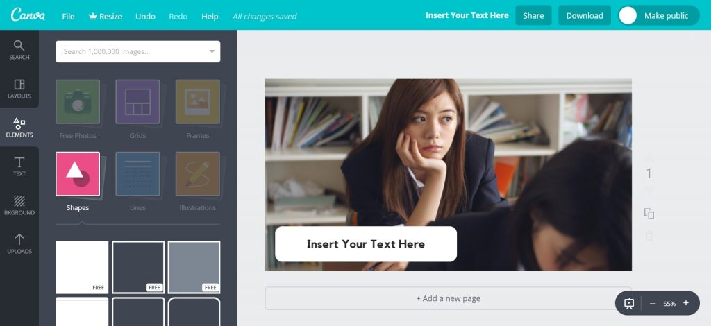
Shapes are useful for creating text boxes, borders and speech bubbles. These catch the eye and makes your ad image stands out.
Click the ‘Elements’ icon on the left bar then click the ‘Shapes’ icon. You will see different types of shapes.
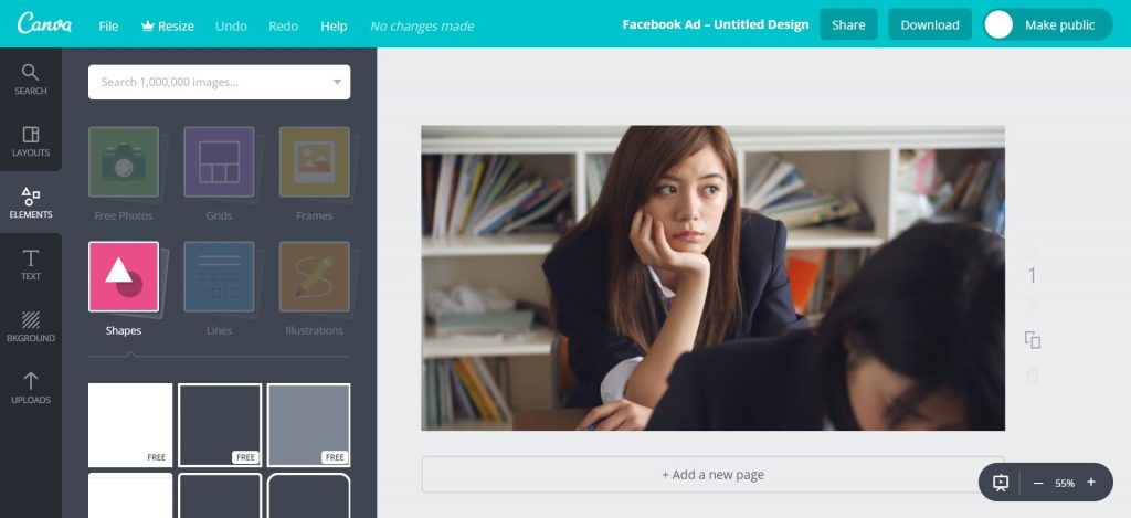
(Credit: Canva)
Text Box
If you plan to add some text in your ad image, you can use a shape to create a text box with a colour that is contrasting to your image.
This will draw the viewers’ eye to the image and make them more likely to read the text in the box.
(Credit: Canva)
In our example above, we used a white background for the text box as the part of the image is relatively dark. This creates a contrast that makes the text box pop out of the image and stands out.
Borders
Using borders is another effective way of creating contrast to catch viewers’ attention.
Borders can be found under the ‘Shapes’ section. It is essentially a shape with a transparent fill and bolded borders.
You can change the colour of the border to create an eye catching contrast.
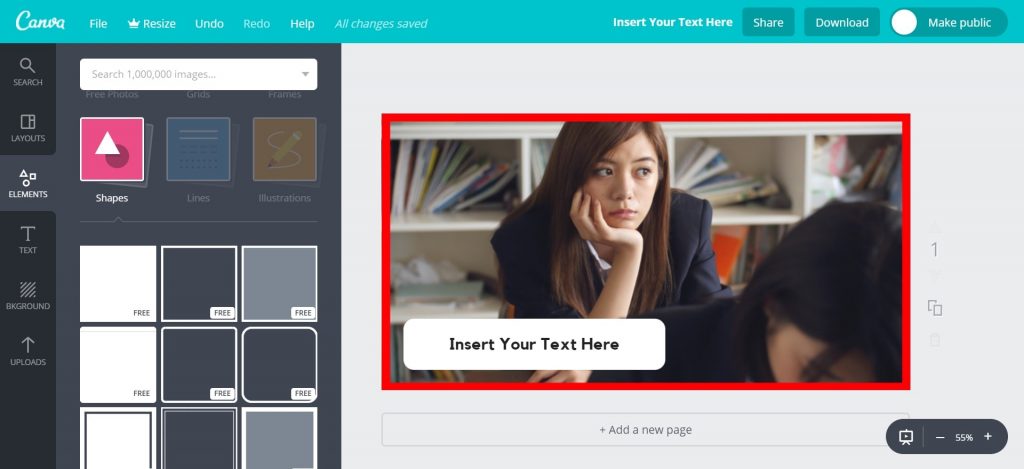
(Credit: Canva)
In our example, we used a red border to make the ad image more striking. If you compare the images, the one with the border stands out more.
The purpose of adding texts to ad images is to call out to your target audience and catch their attention, so they will read you ad.
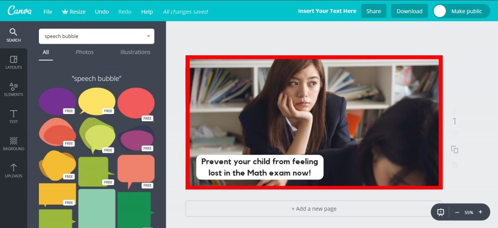
(Credit: Canva)
In our ad image above, we are calling out to concerned parents who want to help their child be confident in the Math exam, instead of looking lost and unsure of how to solve the Math questions.
Speech Bubbles
Speech bubbles are useful for intensifying the emotion in your ad image.
You can search for ‘speech bubble’ in the white search bar.
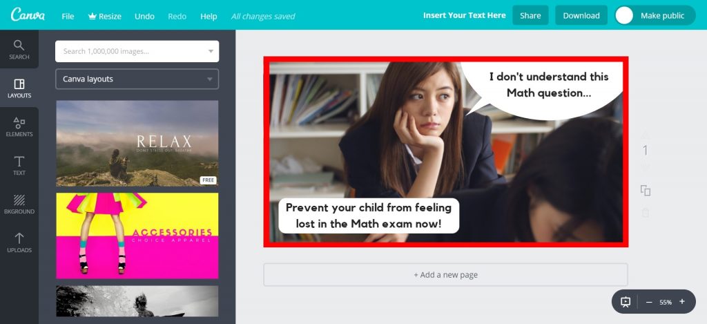
(Credit: Canva)
For our ad image, the text in the speech bubble intensifies the girl’s emotion of looking lost/frustrated.
If the message resonates with the parent viewing the ad, then you would have catch her attention, making her more likely and willing to read your ad.
What Font Should You Use?
Font types affect the readability of your attention cues.
It’s best to use Sans Serif fonts which is a type of font that does not use small lines at the ends of the characters.
This makes it easier or your viewer to read your attention cue, especially on mobile when the ad image is smaller.
In our example above, we used the font ‘Kollektif’ on Canva.
There other Sans Serif fonts on Canva that you can test out such as Aileron Regular, Archivo Black and Arimo.
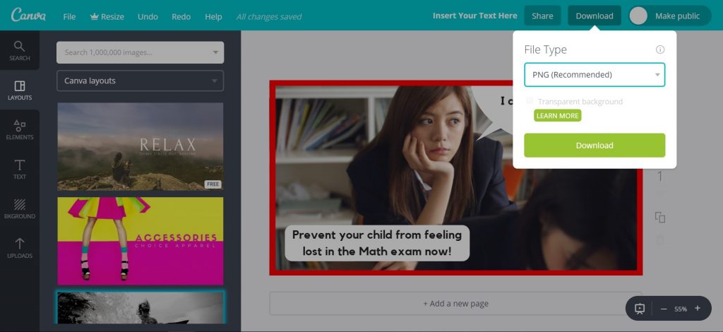
Once you are done creating your ad image, you can download your image by clicking the download button at the top right hand of the page.
We recommend that you can download in either JPG/PNG format.
The file should be downloaded into your computer’s ‘Downloads’ folder.
(Credit: Canva)
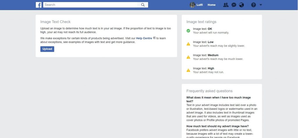
Facebook does not like ad images that contain a lot of text. If the proportion of text to image is too high, then your ad may not reach its full audience.
This is why it is crucial for you to ensure that your ad image abides to Facebook 20% rule.
Go to https://www.facebook.com/ads/tools/text_overlay.
(Credit: Facebook)
Upload your image to check it.
The result will either be OK, Low, Medium or High. The higher the proportion of text to image, the lower your ad’s reach will be.
We recommend that you ensure that your Image Text Check result is OK.
If it’s not OK, go back to Canva and edit the ad image then download it to check again.
Repeat the process until you’re able to get an image with an ‘OK’ result.
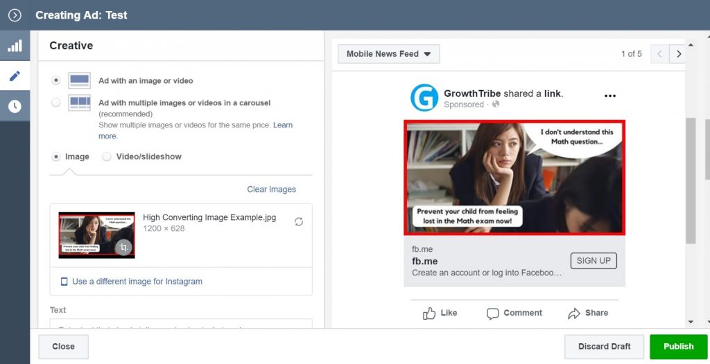
Once you’ve created your high converting ad image and ensure that it abides by Facebook 20% rule, you need to upload it to Facebook via Ads Manager.
Go to www.business.facebook.com.
Select the ad account that you want to publish your ad in.
Click the ‘Ads’ tab on the right.
Click on the green ‘+ Create’ button to make a new ad.
Click the checkbox beside the ad and click Edit. A window will pop out.
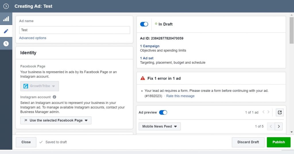
Scroll down and you will see an option to change the image of the ad.
Click on the 2 arrows button below ‘Clear images’. Another window will pop up to prompt you to select an image.
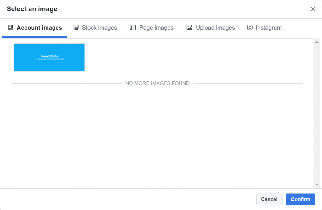
Click on ‘Upload images’.
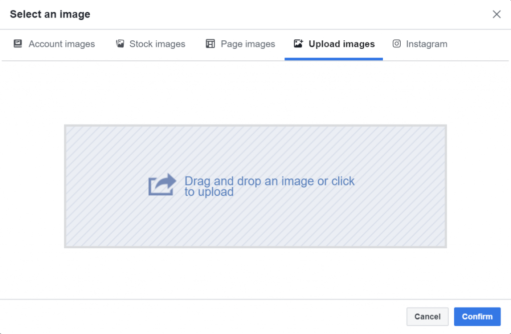
You can drag the image you created from the folder on your computer to the Ads Manager.
You will see your image once it is uploaded. It will be highlighted in blue.
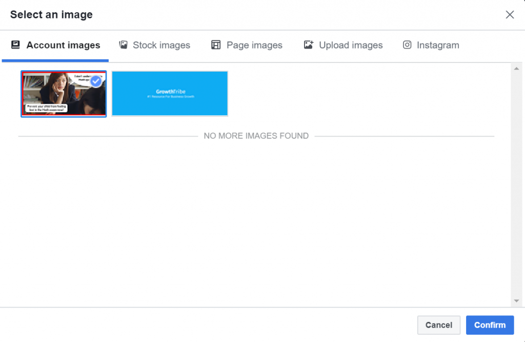
Click confirm and the image will appear in the ad preview on the right side.
How To Improve Your Ad Performance
One of the way you can improve your ad performance is by testing different ad images.
In our How To Launch Your First Facebook Lead Generation Campaign blueprint, we talked about how to structure your campaigns.
Below was what we recommend you use if this is your first time setting up Facebook Ads. The purpose of this structure is to test your ad across different audiences.
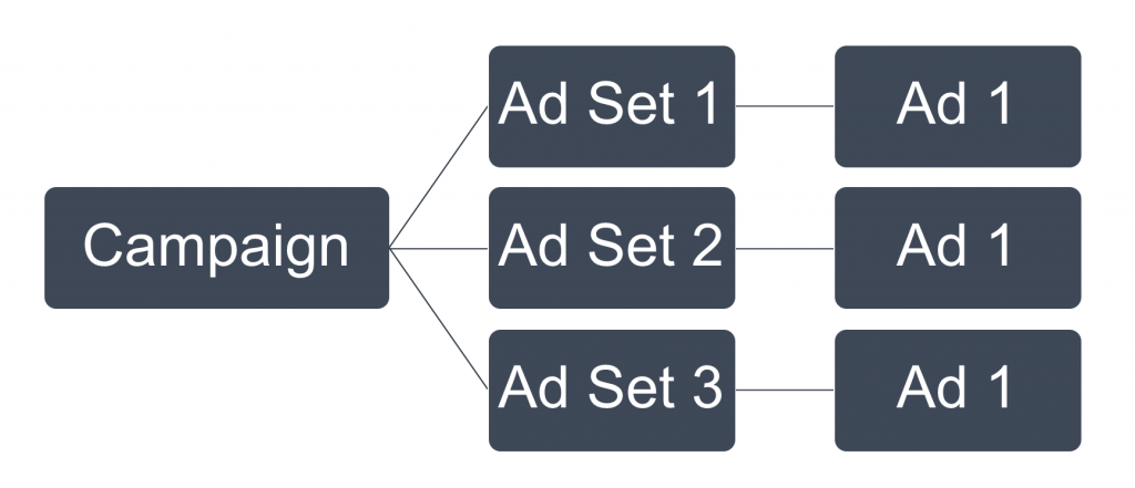
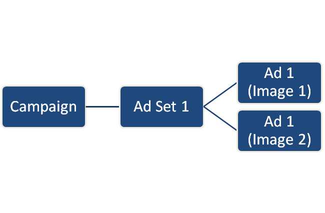
On the other hand, when you want to test different images, you can put 2 of the same ads in the same ad set with different images.
When your campaign goes live, Facebook’s algorithm will automatically allocate more reach and budget to the ad that has the better engagement.
This is great for finding an ad image that works for your campaign.
Here’s an example of a split test we did for a campaign many years back. You’ll notice that we used the exact same copy with different images.

If your goal is to improve your current ad results and lower cost, you can do do by testing images that are only slightly different from one another.
You can still use the same structure we talked about earlier but this time, you’ll make small changes to each ad image.
I can test:
- Different effects
- Different text
It’s important to note that optimization might not always give you breakthrough results in your ads. At best, they can give you incremental improvements.
This is why until you have a working campaign, we often advise clients not to spend too much time on over-optimizing the campaign.
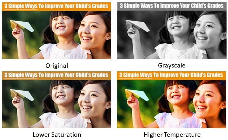
Effects
Let’s say the image of the mother and daughter performs the best.
We’ll then test by changing an effect on the photo.
In the example below, we changed the filter of the original image to grayscale, lower saturation and higher temperature.
Again, we’ll test these images with different filters by placing the 4 ads in the same ad set.
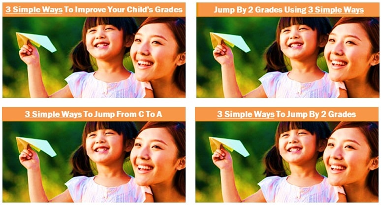
Text
In the example below, we changed the text or each image.
Once again, we’ll test these images with different texts by placing the 4 ads in the same ad set.
The purpose is to test which variation of the text will resonate with the audience.
After you found the better converting image and scaled your campaign, it is important for you to keep testing different images to find the next converting image.
This keeps your ad fresh in the minds and eyes of your audience and helps you avoid ad fatigue.
Ad fatigue takes place when your audience becomes overly familiar with your ads and gets bored of them, so the ads become less engaging.
This is why you should regularly change your ad so it appears to be something new to the market.
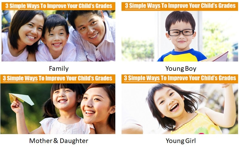
Here’s an example of what we did for this campaign to avoid ad blindness.
Once we found a working ad image, we created variations of the ad image around the same theme – in this case, family and children.
Of course this is just one way to do this.
There are many ways to reduce ad blindness and we’ll share more about it in future blueprints.
What’s Next?
Now that you’ve created your first Facebook ad image, you have a system that will help you generate new ad images.
If you want to learn about to set up and launch a Facebook campaign, you can check out our blueprint ‘How To Launch Your First Facebook Lead Generation Campaign’.